
Ireland's "Great Divergence" continues
Daft Reports
- Ronan Lyons (House Price, Q1 2024)
- Ronan Lyons (Rental Price, Q4 2023)
- Ronan Lyons (House Price, Q4 2023)
- Ronan Lyons (Rental Price, Q3 2023)
- Ronan Lyons (House Price, Q3 2023)
- Ronan Lyons (Rental Price, Q2 2023)
- Ronan Lyons (House Price, Q2 2023)
- Ronan Lyons (Rental Price, Q1 2023)
- Ronan Lyons (House Price, Q1 2023)
- Ronan Lyons (Rental Price, Q4 2022)
- Ronan Lyons (House Price, Q4 2022)
- Ronan Lyons (Rental Price, Q3 2022)
- Ronan Lyons (House Price, Q3 2022)
- Ronan Lyons (Rental Price, Q2 2022)
- Ronan Lyons (House Price, Q2 2022)
- Ronan Lyons (Rental Price, Q1 2022)
- Ronan Lyons (House Price, Q1 2022)
- Ronan Lyons (Rental, Q4 2021)
- Ronan Lyons (House Price, Q4 2021)
- Ronan Lyons (Rental, Q3 2021)
- Ronan Lyons (House Price, Q3 2021)
- Ronan Lyons (Rental, Q2 2021)
- Ronan Lyons (House Price, Q2 2021)
- Ronan Lyons (Rental, Q1 2021)
- Ronan Lyons (House Price, Q1 2021)
- Ronan Lyons (Rental, Q4 2020)
- Ronan Lyons (House Price, Q4 2020)
- Ronan Lyons (Wealth, H2 2020)
- Ronan Lyons (Rental, Q3 2020)
- Ronan Lyons (House Price, Q3 2020)
- Ronan Lyons (Housing, July 2020)
- Ronan Lyons (Housing, June 2020)
- Ronan Lyons (Housing, May 2020)
- Ronan Lyons (Rental, Q1 2020)
- Ronan Lyons (House Price, Q1 2020)
- Ronan Lyons (Rental, Q4 2019)
- Ronan Lyons (House Price, Q4 2019)
- Ronan Lyons (Wealth, H2 2019)
- Ronan Lyons (Rental, Q3 2019)
- Ronan Lyons (House Price, Q3 2019)
- Pierre Yimbog (Rental, Q2 2019)
- Ronan Lyons (House Price, Q2 2019)
- Ronan Lyons (Wealth, H1 2019)
- Ronan Lyons (Rental, Q1 2019)
- Ronan Lyons (House Price, Q1 2019)
- Ronan Lyons (Rental, Q4 2018)
- Ronan Lyons (House Price, Q4 2018)
- Ronan Lyons (Wealth, H2 2018)
- Ronan Lyons (Rental, Q3 2018)
- Ronan Lyons (House Price, Q3 2018)
- Shane De Rís (Rental, Q2 2018)
- Ronan Lyons (House Price, Q2 2018)
- Ronan Lyons (Wealth, 2018)
- Ronan Lyons (Rental, Q1 2018)
- Ronan Lyons (House Price, Q1 2018)
- Ronan Lyons (Rental, Q4 2017)
- Ronan Lyons (House Price, Q4 2017)
- Ronan Lyons (Rental, Q3 2017)
- Ronan Lyons (House Price, Q3 2017)
- Katie Ascough (Rental, Q2 2017)
- Ronan Lyons (Wealth, 2017)
- Ronan Lyons (House Price, Q2 2017)
- Ronan Lyons (Rental, Q1 2017)
- Ronan Lyons (House Price, Q1 2017)
- Ronan Lyons (Rental, Q4 2016)
- Ronan Lyons (House Price, Q4 2016)
- Ronan Lyons (Rental, Q3 2016)
- Ronan Lyons (House Price, Q3 2016)
- Ronan Lyons (School Report, 2016)
- Conor Viscardi (Rental, Q2 2016)
- Ronan Lyons (Rail Report, 2016)
- Ronan Lyons (House Price, Q2 2016)
- Ronan Lyons (Rental, Q1 2016)
- Ronan Lyons (House Price, Q1 2016)
- Ronan Lyons (Rental, Q4 2015)
- Ronan Lyons (House Price, Q4 2015)
- Ronan Lyons (Rental, Q3 2015)
- Ronan Lyons (House Price, Q3 2015)
- Marcus O'Halloran (Rental, Q2 2015)
- Ronan Lyons (House Price, Q2 2015)
- Ronan Lyons (Rental, Q1 2015)
- Ronan Lyons (House Price, Q1 2015)
- Ronan Lyons (Rental, Q4 2014)
- Ronan Lyons (House Price, Q4 2014)
- Ronan Lyons (Rental, Q3 2014)
- Ronan Lyons (House Price, Q3 2014)
- Domhnall McGlacken-Byrne (Rental, Q2 2014)
- Ronan Lyons (House Price, Q2 2014)
- Ronan Lyons (Rental, Q1 2014)
- Ronan Lyons (House Price, Q1 2014)
- Ronan Lyons (Rental, Q4 2013)
- Ronan Lyons (House Price, Q4 2013)
- Ronan Lyons (Rental, Q3 2013)
- Ronan Lyons (House Price, Q3 2013)
- Ronan Lyons (Rental, Q2 2013)
- Ronan Lyons (House Price, Q2 2013)
- Ronan Lyons (Rental, Q1 2013)
- Ronan Lyons (House Price, Q1 2013)
- Ronan Lyons (Rental, Q4 2012)
- Ronan Lyons (House Price, Q4 2012)
- Lorcan Sirr (Rental, Q3 2012)
- Padraic Kenna (House Price, Q3 2012)
- John Logue (Rental, Q2 2012)
- Ronan Lyons (House Price, Q2 2012)
- Barry O'Leary (Rental, Q1 2012)
- Seamus Coffey (House Price, Q1 2012)
- Joan Burton (Rental, Q4 2011)
- Ronan Lyons (House Price, Q4 2011)
- Philip O'Sullivan (Rental, Q3 2011)
- Sheila O'Flanagan (House Price, Q3 2011)
- Rachel Breslin (Rental, Q2 2011)
- Constantin Gurdgiev (House Price, Q2 2011)
- Cormac Lucey (Rental, Q1 2011)
- Eoin Fahy (House Price, Q1 2011)
- Lorcan Roche Kelly (Rental, Q4 2010)
- Ronan Lyons (House Price, Q4 2010)
- John Fitzgerald (Rental, Q3 2010)
- Patrick Koucheravy (House Price, Q3 2010)
- Gary Redmond (Rental, Q2 2010)
- Jim Power (House Price, Q2 2010)
- Jill Kerby (Rental, Q1 2010)
- Brian Lucey (House Price, Q1 2010)
- Michael Taft (Rental, Q4 2009)
- Alan McQuaid (House Price, Q4 2009)
- Dr. Charles J. Larkin (Rental, Q3 2009)
- Emer O'Siochru (House Price, Q3 2009)
- Ronan Lyons (Rental, Q2 2009)
- Oliver Gilvarry (House Price, Q2 2009)
- Brian Devine (Rental, Q1 2009)
- Dr. Liam Delaney (House Price, Q1 2009)
- Gerard O'Neill (Rental, Q4 2008)
- Ronan Lyons (House Price, Q4 2008)
- Dr. Stephen Kinsella (Rental, Q3 2008)
- Moore McDowell (House Price, Q3 2008)
- Shane Kelly (Rental, Q2 2008)
- Fergal O'Brien (House Price, Q2 2008)
- Eoin O'Sullivan (Rental, Q1 2008)
- Dermot O'Leary (House Price, Q1 2008)
- Dan O'Brien (Rental, Q4 2007)
- Frances Ruane (House Price, Q4 2007)
- John McCartney (Rental, Q3 2007)
- Ronnie O'Toole (House Price, Q3 2007)
- Ronan Lyons (Rental, Q2 2007)
- Constantin Gurdgiev (House Price, Q2 2007)
- Fintan McNamara (Rental, Q1 2007)
- Rossa White (House Price, Q1 2007)
- Geoff Tucker (Rental, Q4 2006)
- Damien Kiberd (House Price, Q4 2006)
- Pat McArdle (House Price, Q3 2006)
- Marc Coleman (House Price, Q2 2006)
- David Duffy (House Price, Q1 2006)
- Austin Hughes (House Price, Q4 2005)
- David McWilliams (House Price, Q2 2005)

1st Jul 2013
Ronan Lyons, Daft's in-house economist, commenting on the latest Daft research on the Irish property market.
Ireland's "Great Divergence" continues
The Great Divergence is a term used by economic historians to describe one of the momentous developments in world history – when European incomes rose above subsistence levels for the first time, while those in the rest of the world lagged behind. On a much smaller scale, we are witnessing a "Great Divergence" in the Irish housing market currently. The latest Daft.ie Report confirms this – asking prices in Dublin are up more than 5% year-on-year, while asking prices in the rest of the country are down almost 10%.
This is certainly the first time such rapid growth in asking prices has been recorded anywhere in the country for almost six years. Indeed, the rate of growth in asking prices in South County Dublin now is faster than it was in Q1 2007 (10.7%). The underlying cause is a lack of supply in the capital, while demand has steadily been rising. The number of transactions in Dublin in the six months to March was – according to the Price Register – 4,300. This compares to 3,000 for the same period to March 2012 and 2,500 in the six months to March 2011.
At the same time, the choice available to buyers in Dublin has dwindled. For all of the period 2008-2011, there was an average of 6,000 Dublin properties to choose from at any one time. The figure for 2013 so far is barely half this (3,170). The same trend is happening nationally – total stock on the market is down from an average of 60,000 in 2008-2011 to 41,000 now – but in most parts of the country, there remains the equivalent of 2-4 years worth of transactions sitting on the market. In Dublin, the figure is roughly 7 months. What compounds the situation for Dublin is that there is no backlog of family homes sitting in ghost estates.
It is likely, then, that over the next 12-24 months, we may have to get used to the idea of prices rising in some places – particularly in urban areas – while they fall elsewhere. In a sense, no-one is going to be happy: markets with falling prices are ones where sellers are frustrated and buyers are nervous about “catching the falling knife”. In rising markets, buyers will – just as they did before 2008 – feel like they have less time than they would like for what is one of the most important financial decisions they will make.
The key is information. Where people are using the proper information to inform their decisions, they are less likely to rush into a bad one. This is not about large streams of data; this is about focusing on a few core indicators, to give an asking price or an offer some context. The price-to-income ratio is a well-known metric. As long as buyers are factoring in energy and commuting costs into their price, this is an excellent starting point. (Put another way, buying a D-rated home for 3% less is a false economy if it translates into higher energy bills that add up to more per month than the saving in mortgage repayment.)
A second common metric is the price-to-rent ratio. While this can be tougher to pin down, market analysts generally agree than a price which is only 10 times annual rent is a good price and somewhere between 15 and 20 times annual rent can make sense, depending on the exact circumstances of those involved. In contrast, people during the bubble in Ireland were offering 40 or sometimes 50 times the annual rent. If they had been told this at the time, it might have been somewhat clearer that they were taking on so much risk.
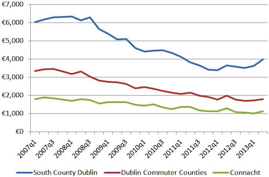
Lastly, there is the price per square metre metric. This is commonly used throughout Europe but, for whatever reason, hasn't taken off in Ireland or the UK to the same extent. Fortunately, while not every listing on Daft.ie includes square metres, there have been almost 200,000 ads since 2006 that have. The graph above uses these ads to chart average price per square metre in three different markets – South County Dublin, Dublin's commuter counties, and Connacht (outside of Galway City) – from the end of the bubble to now. The rebound in prices in South County Dublin since mid-2011 is noticeable.
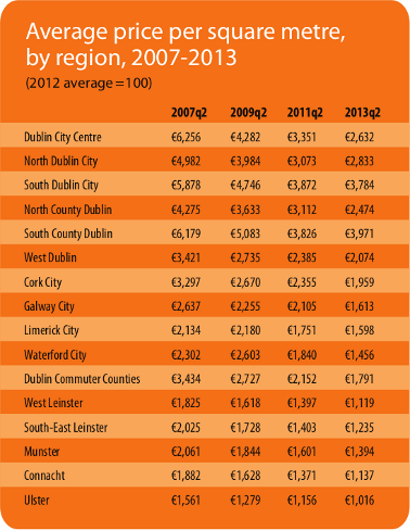
On the issue of size – but not location and amenities – price per square metre is an excellent way of making like-for-like comparisons and understanding “bang for your buck”. Getting buyers and sellers to think in price per square metre will level the playing field in the property market and also concentrate the minds of both groups: “If I'm looking for significantly more per square metre than other properties in my area, why?” “What is my offer in per-square-metre terms and how does it compare to prevailing rates in the area?” The table below shows the average price per square metre sought in sixteen different markets around the country at four points: mid-2007, mid-2009, mid-2011 and currently.
Future Daft.ie Reports will be publishing more price per square metre information. Hopefully, this will contribute to be a better understanding of this key metric of the market and with better informed consumers, we are less likely to fall into so severe a bubble as the one we are still recovering from.
HIGHLIGHTS:
Asking Prices, Residential Sales
Stock and Flow of Sale Properties
SNAPSHOT:
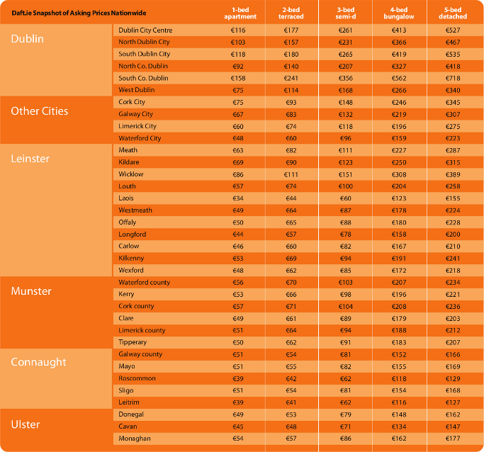
Snapshot of Asking Prices Nationwide